„Für unser Verlagsprogramm in der zweiten Hälfte von 2017 planen wir ein Buch mit dem Arbeitstitel „Creative Extreme“, in dem wir herausragende kreative Persönlichkeiten aus aller Welt vorstellen wollen, die allgemein bekannte Kreativtechniken auf eine extreme Ebene erheben. Von besonderem Interesse sind dabei Menschen, die in besonders großen oder kleinen Maßstäben oder mit überwältigenden Mengen arbeiten, die Techniken und Materialien auf raffinierte Art und Weise anwenden oder außergewöhnliche Kulissen für ihre Werke nutzen.“
Auf Basis dieser ersten Informationen erhielt ich im Dezember 2016 die Anfrage, ob ich Interesse hätte, mit meiner Technik Dotting Art Teil des besagten Projekts zu werden. Was zuerst im Spam-Ordner gelandet war und auch bei der ersten Sichtung für mich zuerst als einer der vielen fragwürdigen Emails ausgesehen hatte, entpuppte sich am Ende als ein festgebundenes und hochwertiges Buch mit 239 Seiten, in dem auf jeweils vier Seiten Künstler und Kunstschaffende mit Ihren Techniken und Arbeiten vorgestellt wurden.
Und irgendwie ist man dann doch stolz, wenn man sich zu einer Auswahl an Künstlern zählen darf, die im Buch CREATIVE EXTREMES vom Verlag mit den Worten bezeichnet werden: „Wir haben uns auf die Suche nach den Kreativsten der Kreativen begeben.“ Unter Ihnen Guido Daniele mit seinen bemalten Händen, die Tierköpfe extrem realistisch darstellen oder Ramon Bruin mit seinen 3D-Bleistiftzeichnungen. Aus der ganzen Welt kommen die Leute und neben Anya Midori bin ich einer von nur zwei deutschen Künstlern, die hier vertreten sind. Besten Dank an den frechverlag aus Stuttgart.
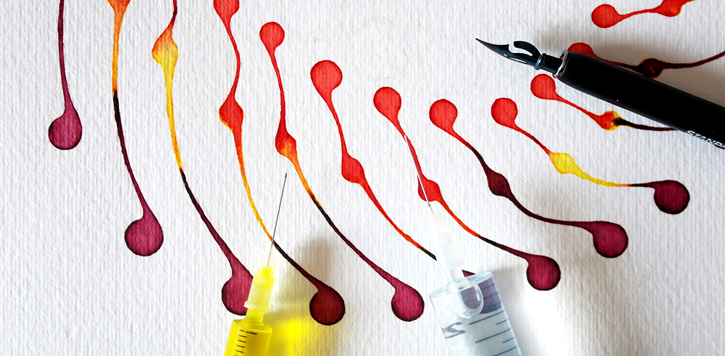
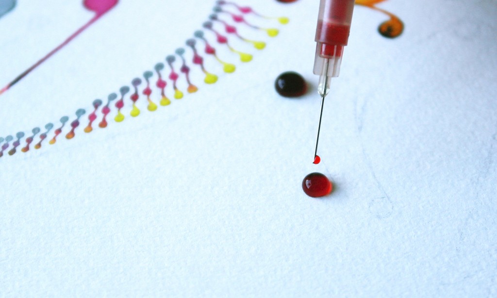
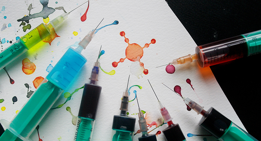
For my Dotting artwork I use syringes for applying colour
I developed Dotting as a painting technique in 2015. What began just as an idea in my mind has become a perfection orientated process based on first artworks and sketches. The technique Dotting requires above all three things: patience, sensitivity and an ease of mind. The particular thing about Dotting artwork is the tool that is used for it. The colour is applied precisely using syringes so that an ornamental composition of elements joined by minimal colour transitions is created. The white surface of the paper provides the border so that the elements have no contact with one another.
Farbauftrag mit medizinischer Spritze – Dotting
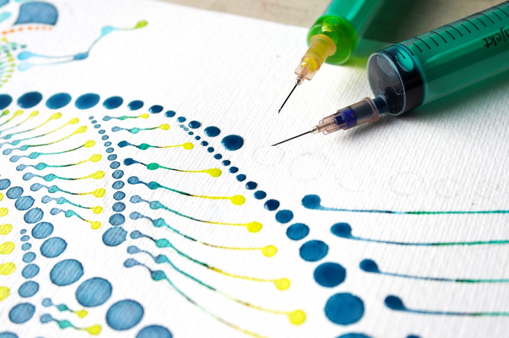
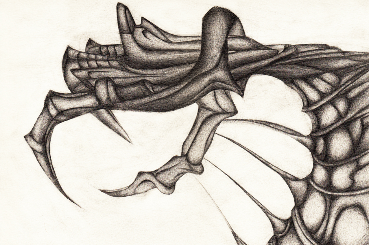
Dotting structure of a wing
Dotting structure
By choosing the object the sketching and capturing of an optimal structure for the Dotting technique begins. The created structure is the main part of every artwork and represents the visual look and the effect generated by the Dotting technique. If the structure misfits, the whole composition appears unbalanced and unequal.
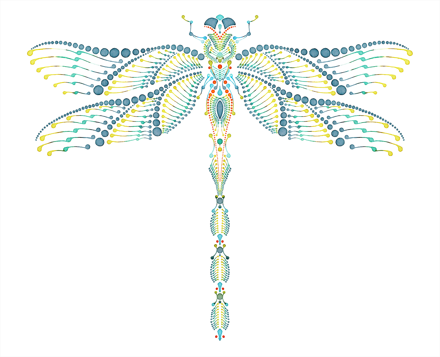
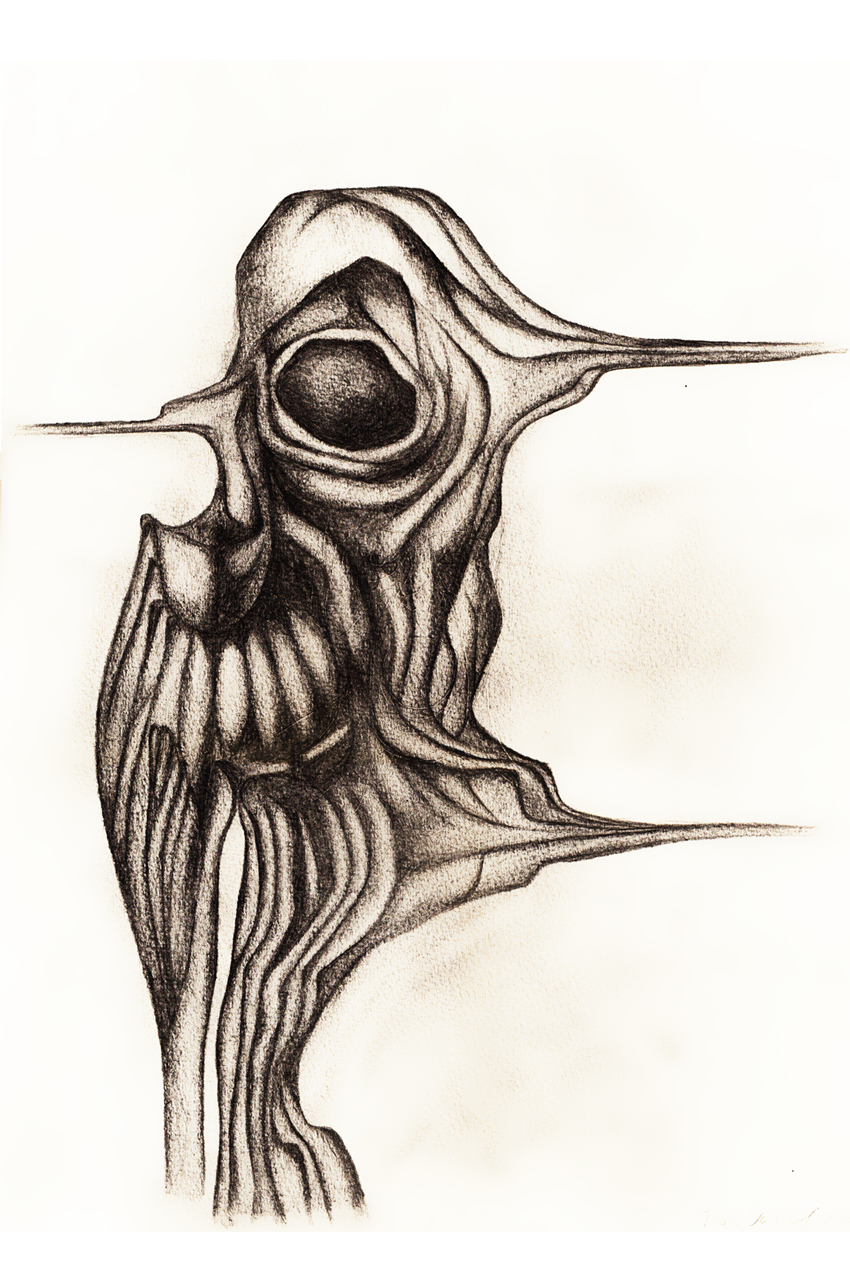
Skizze „Dragonfly“
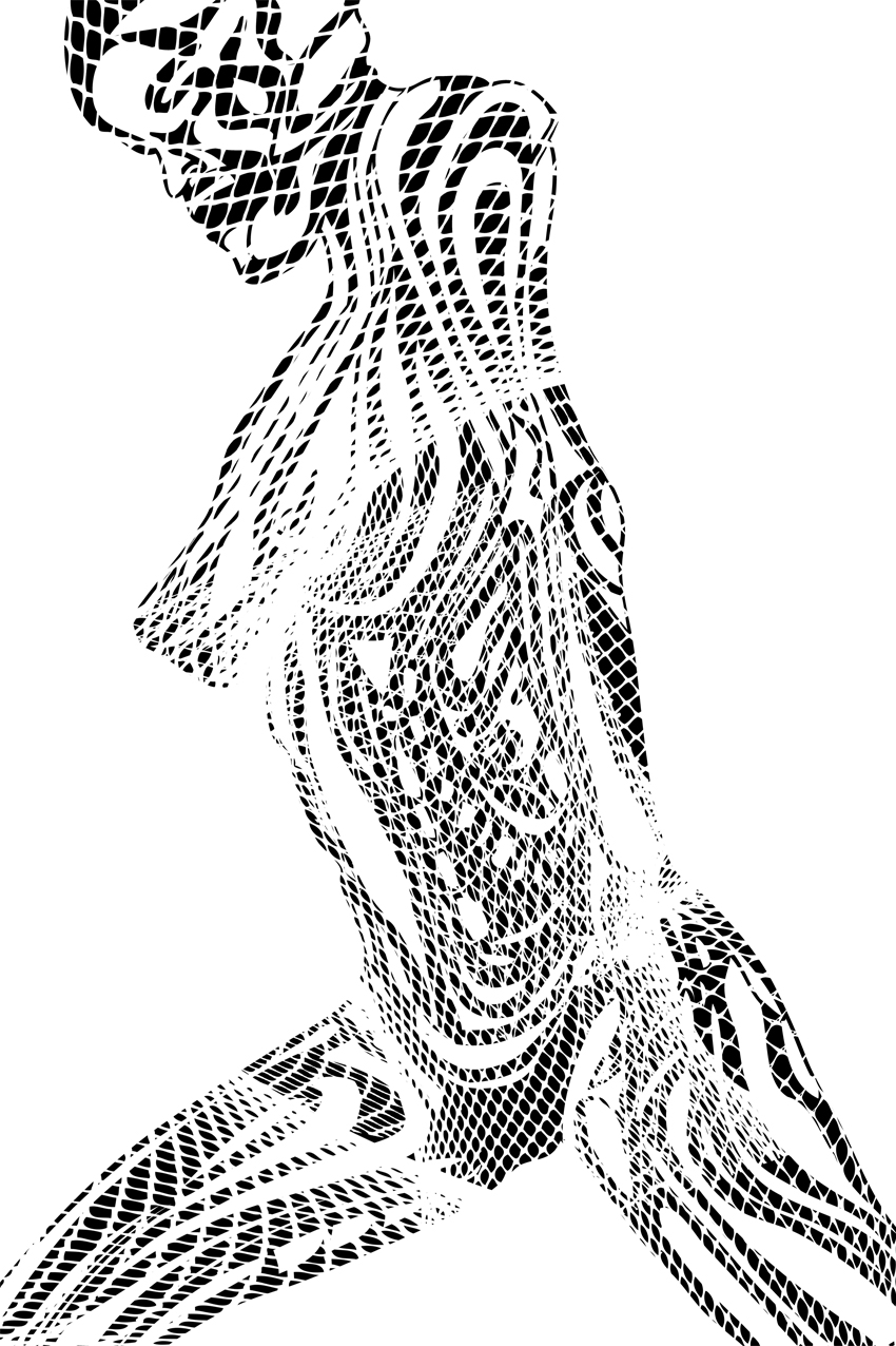
Sketch „FACE“ parts
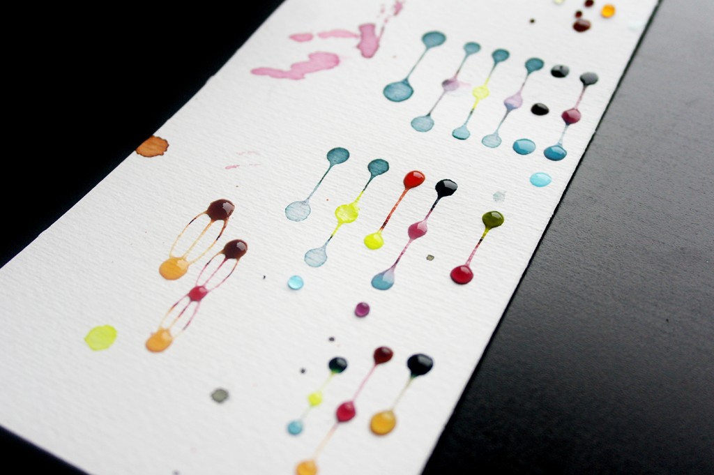
Dotting Farbtests
Therefore every artwork requires coming to terms with the basic form of the object itself. How is the object constructed, where are the basic areas, where are edges and where the axes? What can be extended or modified to accentuate the surreal? The next step is to create structure elements by drawing quick strokes. These strokes are extended steadily until a first possible overall structure is generated. After this step watercolour is applied to the paper for further processing. A first version arises. By creating this version possible inequalities can be captured and optimized in the second or also third version. The final version matches the optimum of my personal imagination concerning the chosen object.
Dragonfly V1 – Watercolour on paper – 02.2016
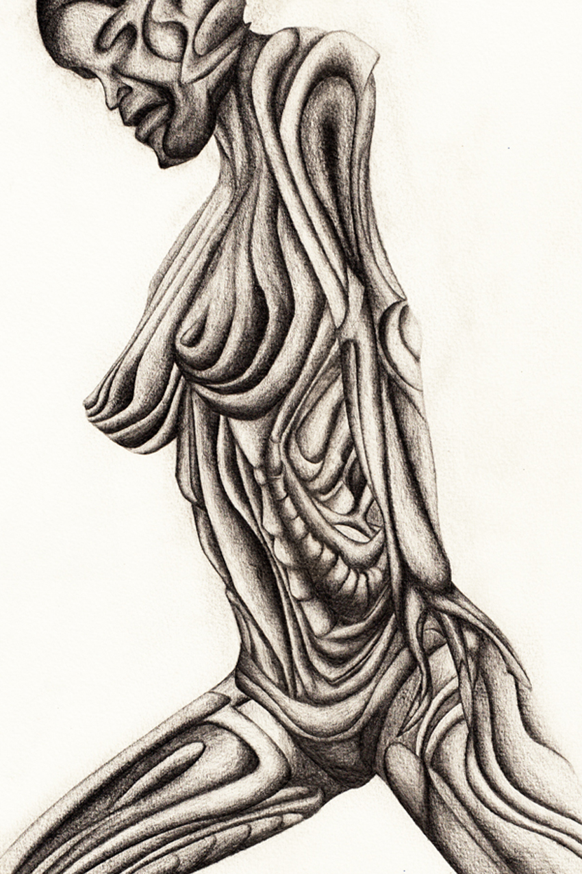
FACE V1 – Watercolour on paper – 02.2016
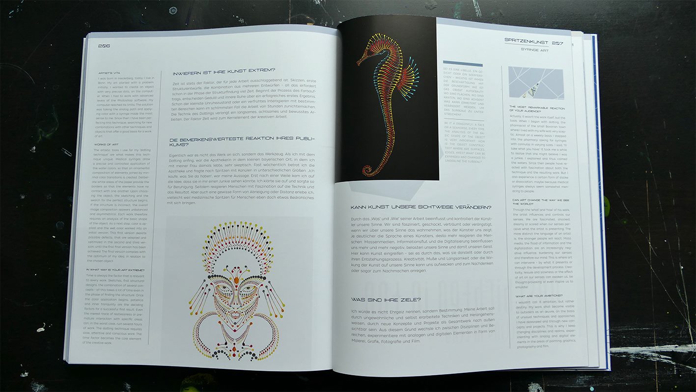
Looking at the Dotting artwork it is not about the object, it is more about the process itself and its single steps. Starting with the first sketches, studies and compositions up to the last step – applying the colour to the paper by using the syringes in a meditative and concentration requiring way. I want the viewer to experience the process in a visual and mental way. Time is always the crucial factor for every artwork. When the paint application process starts patience and ease of mind do influence the final successful result. The smallest state of anxiety or a previous interaction with certain parts can wreck hours of work. Dotting as a technique requires working slowly, cautiously and sensibly. Time is the core element of the meditation and concentration needed.
Dotting as an art and illustration technique is still in a genesis phase. The aim is to optimise and to extend the technique to a maximum. New forms, new structures, working with different kinds of colours and also large formats. The challenge is to transfer structures to large formats in a target-aimed way and to afford effects as a result. The paint application is the same but the dots get wider, they behave different and create another optical effect depending on the kind of colour and the painting ground.
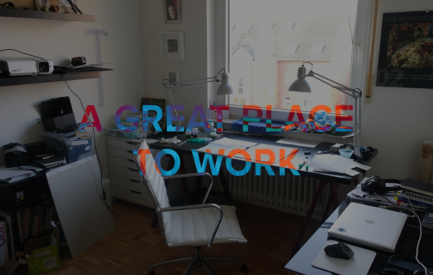
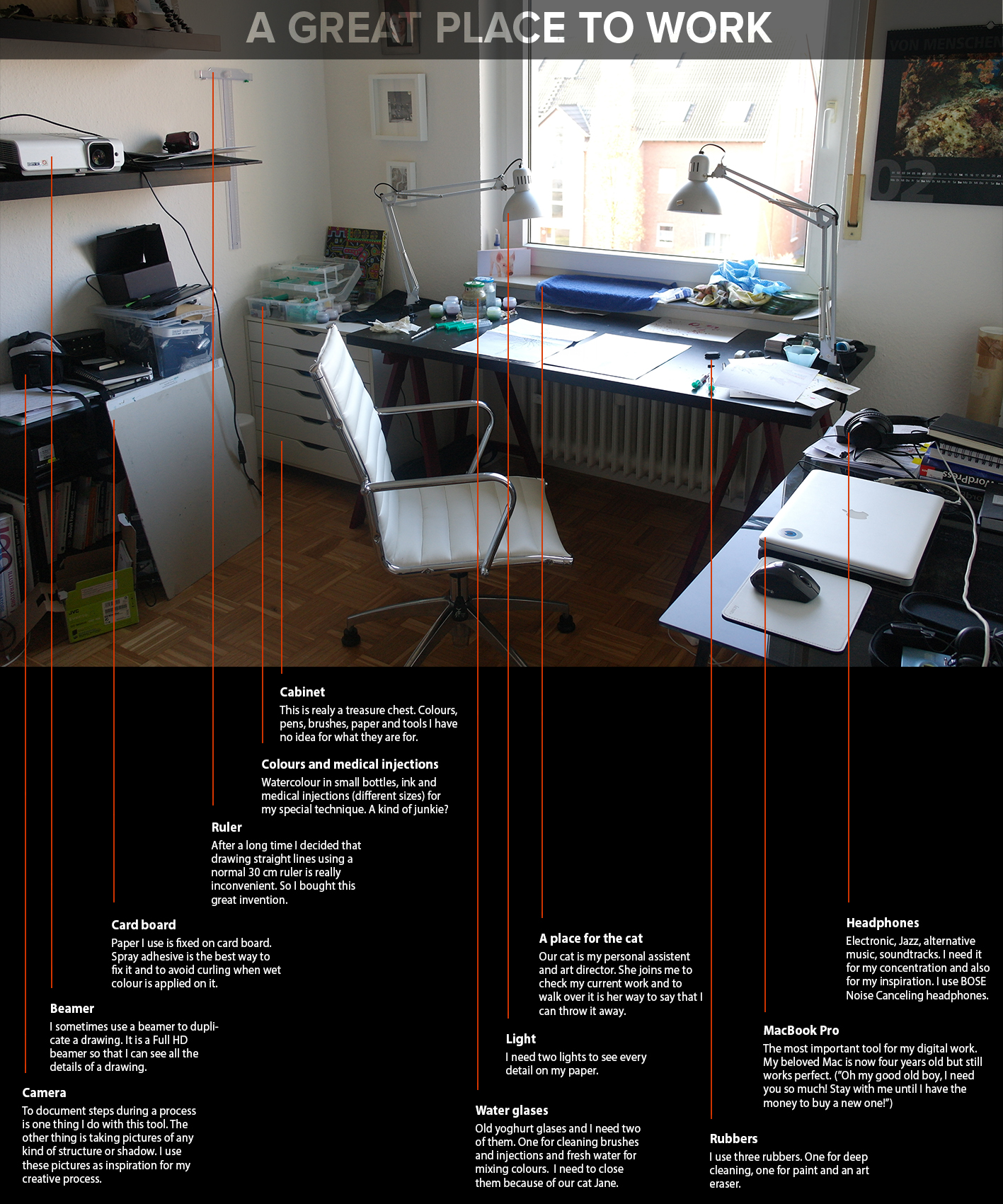
There are plenty of things I use almost every day to do my artwork and creative stuff. Pens, watercolour, ink, my Mac or three different rubbers. To show all of them would be almost impossible as there are so may things in my cabinet. Here are twelve of the things I need almost every day for my artwork.
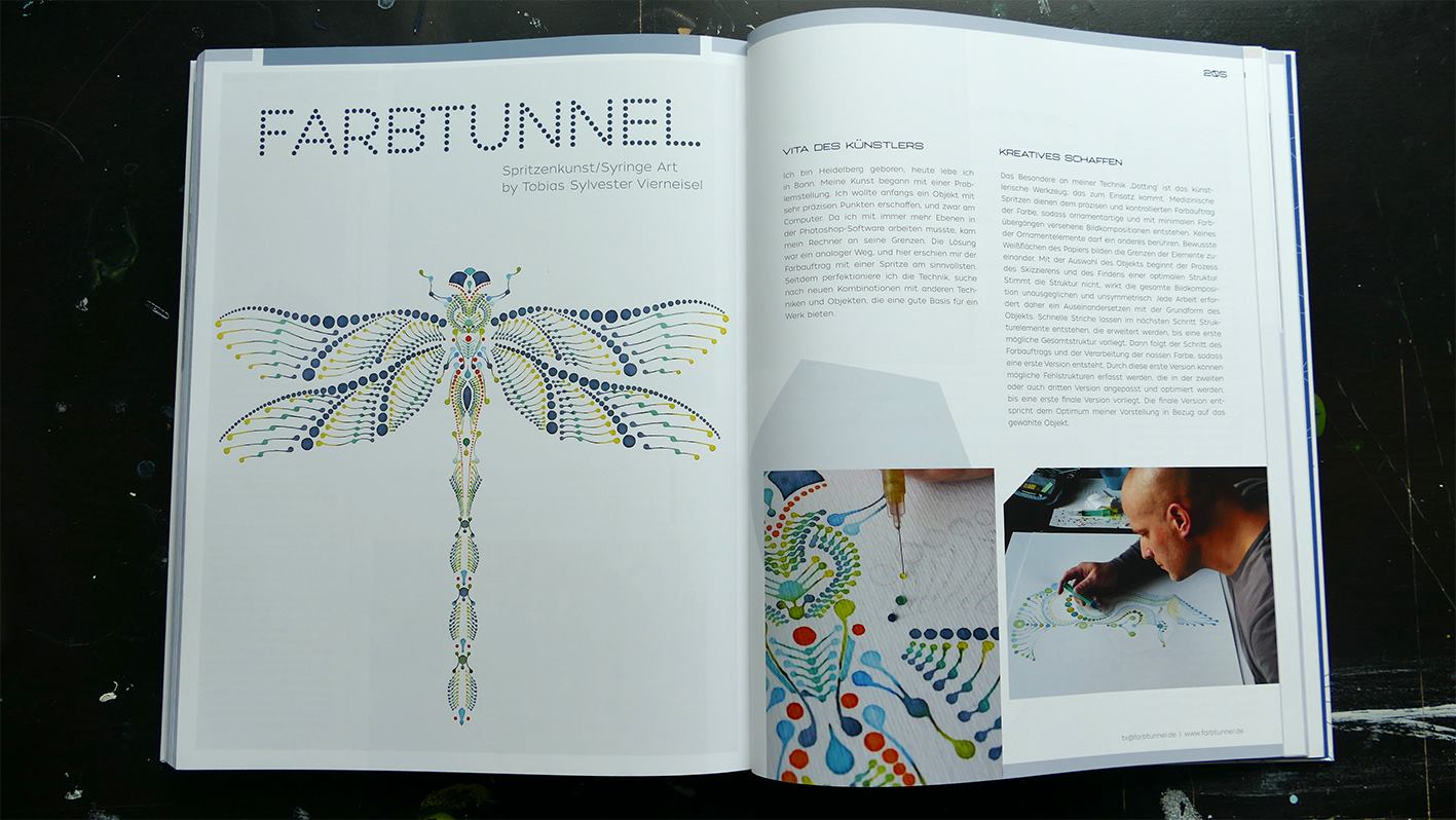
Medizinische Spritzen als grafisches Werkzeug für den Farbauftrag
Dotting als Illustrationstechnik habe ich 2015 entwickelt. Was als Idee angefangen hatte, ist auf Basis von ersten Arbeiten und Studien heute zu einem perfektionsorientierten Prozess geworden. Insbesondere drei Dinge erfordert die Technik Dotting: Geduld, Feingefühl und innere Ruhe.
Das besondere an Dotting ist das künstlerische Werkzeug, das zum Einsatz kommt. Medizinische Spritzen dienen dem präzisen und kontrollierten Farbauftrag der Aquarellfarbe, sodass ornamentartige und mit minimalen Farbübergängen versehene Bildkompositionen entstehen. Keines der Ornamentelemente darf ein anderes berühren. Bewusste Weißflächen des Papiers bilden die Grenzen der Elemente zueinander.
Farbauftrag mit medizinischer Spritze – Dotting
Dotting structure of a wing
Dotting structure
Mit der Auswahl des Objekts beginnen die Skizzierung und das Finden einer für das Dotting optimalen Struktur. Diese Struktur ist der Anteil jeder Arbeit, der das Gesamtbild und das Wirken des durch das Dotting erzeugten visuellen Effekts ausmacht. Stimmt die Struktur nicht, wirkt die gesamte Bildkomposition unausgeglichen und unsymmetrisch.
Skizze „Dragonfly“
Sketch „FACE“ parts
Dotting Farbtests
Jede Arbeit erfordert daher ein Auseinandersetzen mit der Grundform des Objekts. Wie ist das Objekt aufgebaut, wo sind Flächen, wo sind Kanten, wo sind Achsen? Was kann erweitert und was verändert werden, um das Surreale zu unterstreichen? Oft kommen daher unterschiedliche Bildansichten eines Objekts zum Einsatz, werden kombiniert mit Elementen anderer Objekte, sodass sich ein stetiges sich Wegbewegen von der realen Darstellung vollzieht. Schnelle Striche lassen im nächsten Schritt Strukturelemente entstehen, die stetig erweitert werden, bis eine erste mögliche Gesamtstruktur vorliegt. Dann folgt der Schritt des Farbauftrags und der Verarbeitung der nassen Farbe, sodass eine erste Version entsteht. Durch diese erste Version können mögliche Fehlstrukturen erfasst werden, die in der zweiten oder auch dritten Version angepasst und optimiert werden, bis eine erste finale Version vorliegt. Die finale Version entspricht dem Optimum meiner Vorstellung in Bezug auf das gewählte Objekt.
Dragonfly V1 – Watercolour on paper – 02.2016
FACE V1 – Watercolour on paper – 02.2016
In den Dotting-Arbeiten geht es weniger um das Objekt an sich, sondern um den Schaffensprozess in seinen Einzelschritten. Von den Anfangsskizzen, über erste Studien, die Komposition aus Elementen, die Farbwahl und die finale fast meditative und konzentrationsfordernde Umsetzung mit Hilfe der mit Aquarellfarbe gefüllten medizinischen Spritzen. Der Betrachter soll den Prozess visuell wahrnehmen können.
Zeit ist stets der Faktor, der für jede Arbeit ausschlaggebend ist. Beginnt der Prozess des Farbauftrags, entscheiden Geduld und innere Ruhe über ein erfolgreiches finales Ergebnis. Schon der kleinste Unruhezustand oder ein verfrühtes Interagieren mit bestimmten Bereichen kann im schlimmsten Fall die Arbeit von Stunden zunichte machen. Die Technik des Dottings verlangt ein langsames, achtsames und bewusstes Arbeiten. Der Faktor Zeit wird zum Kernelement der kreativen Arbeit.
Dotting als Technik befindet sich weiterhin in einem Entstehungsprozess. Ziel ist es, die Technik maximal zu optimieren und zu erweitern. Neue Formen, neue Strukturen und das Arbeiten mit anderen Farben. Großformate und das Arbeiten auf Leinwand und damit auf großen Flächen. Die Herausforderung besteht darin, die Strukturmöglichkeiten auf große Flächen zu übertragen, andere Farbarten wie Acryl zielführend einzusetzen und eine entsprechende Wirkung zu erzielen. Der Farbauftrag bleibt gleich aber die Dots werden größer, verhalten sich auf dem Untergrund anders und erzeugen eine eigene optische Wirkung je nach Farbart und Untergrund.
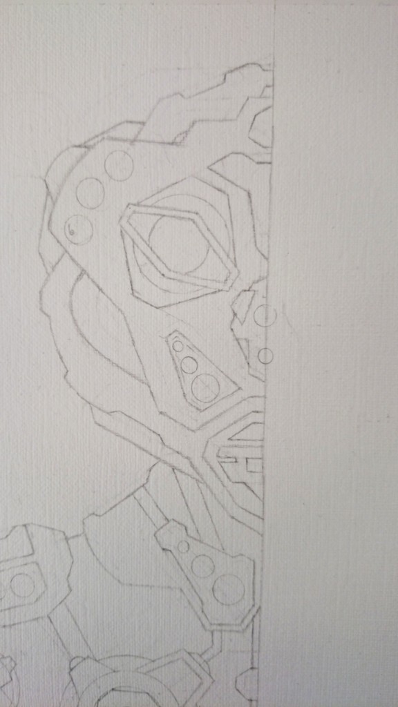
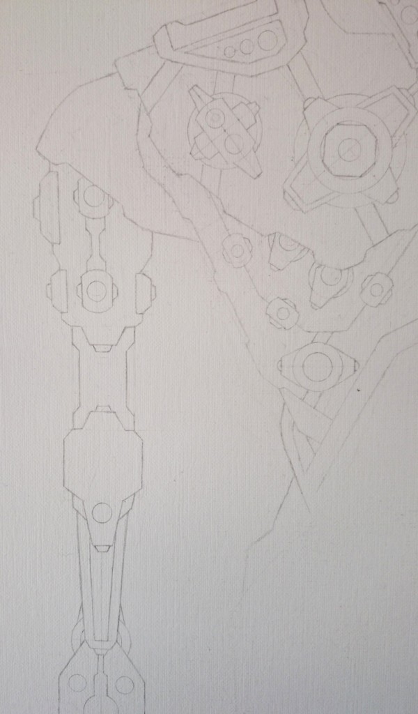
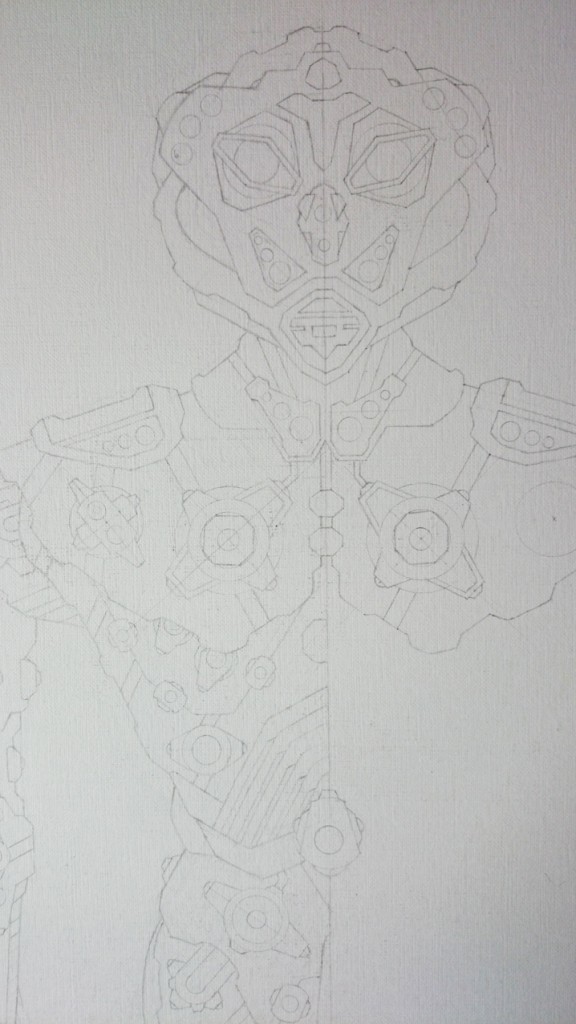
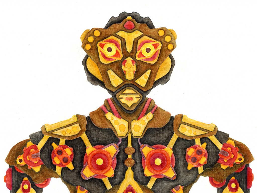
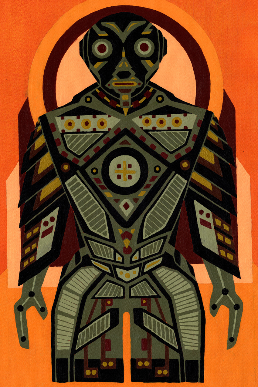
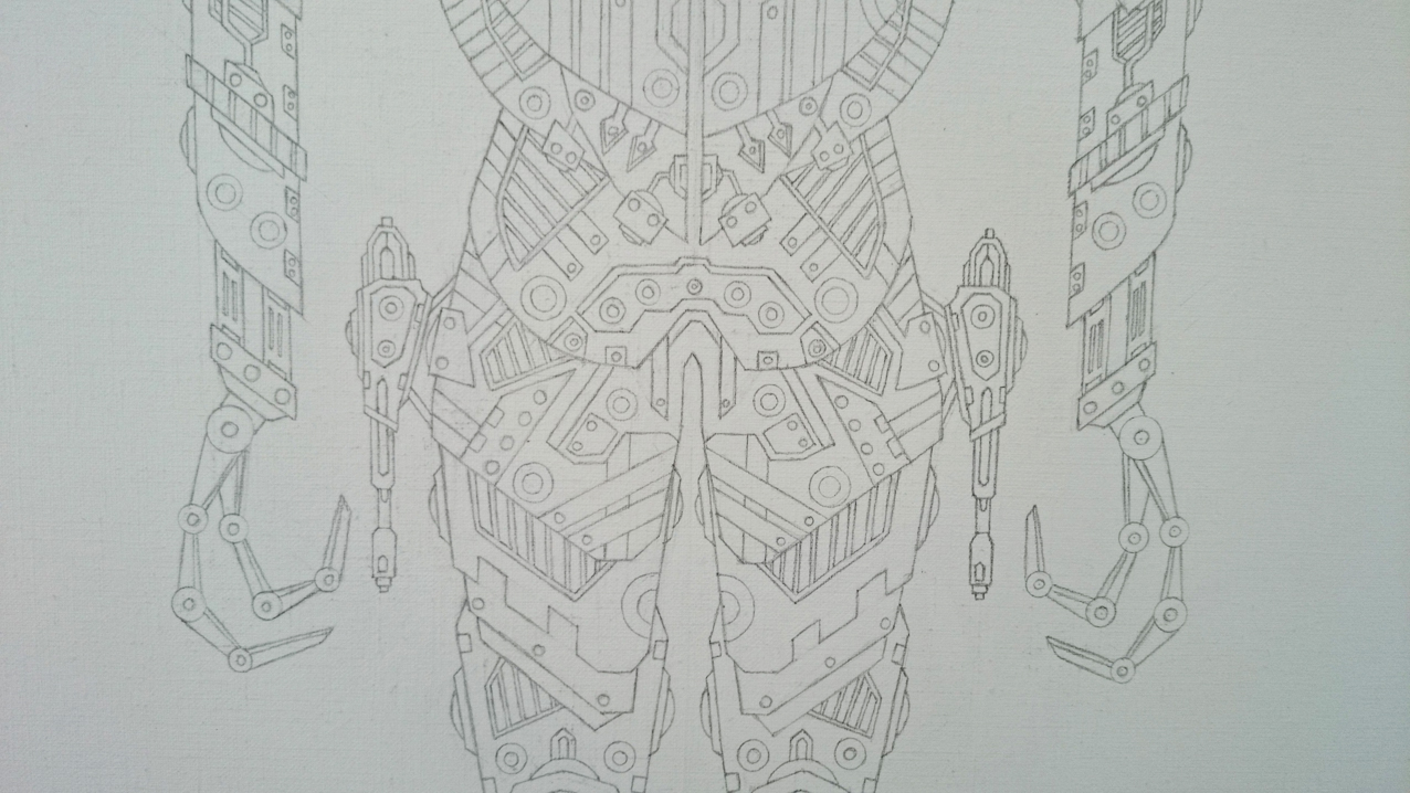
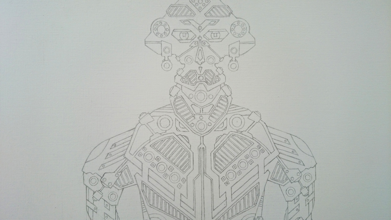
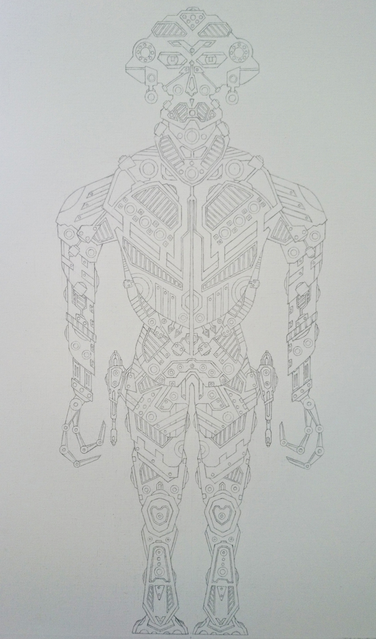
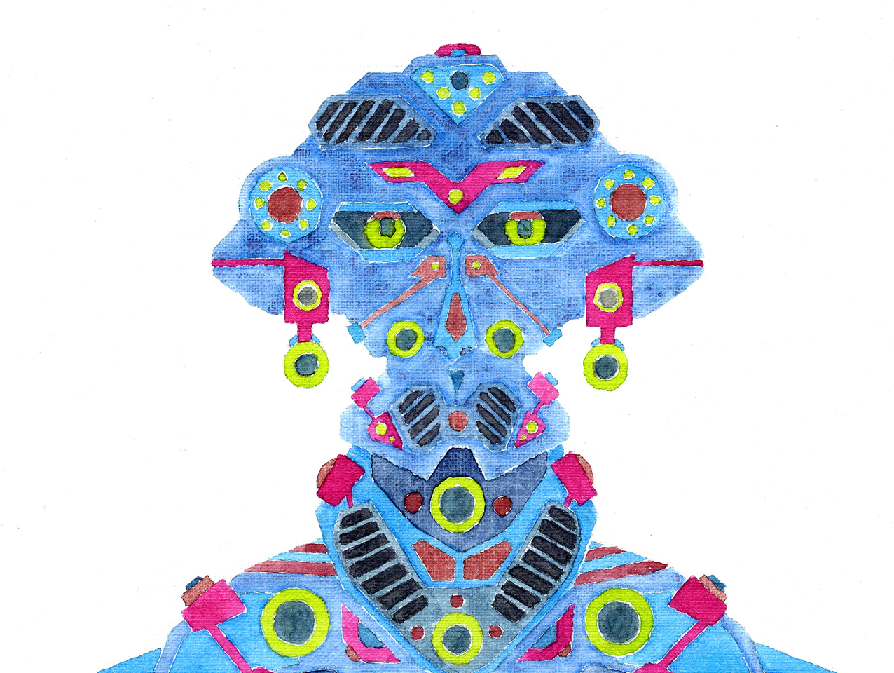
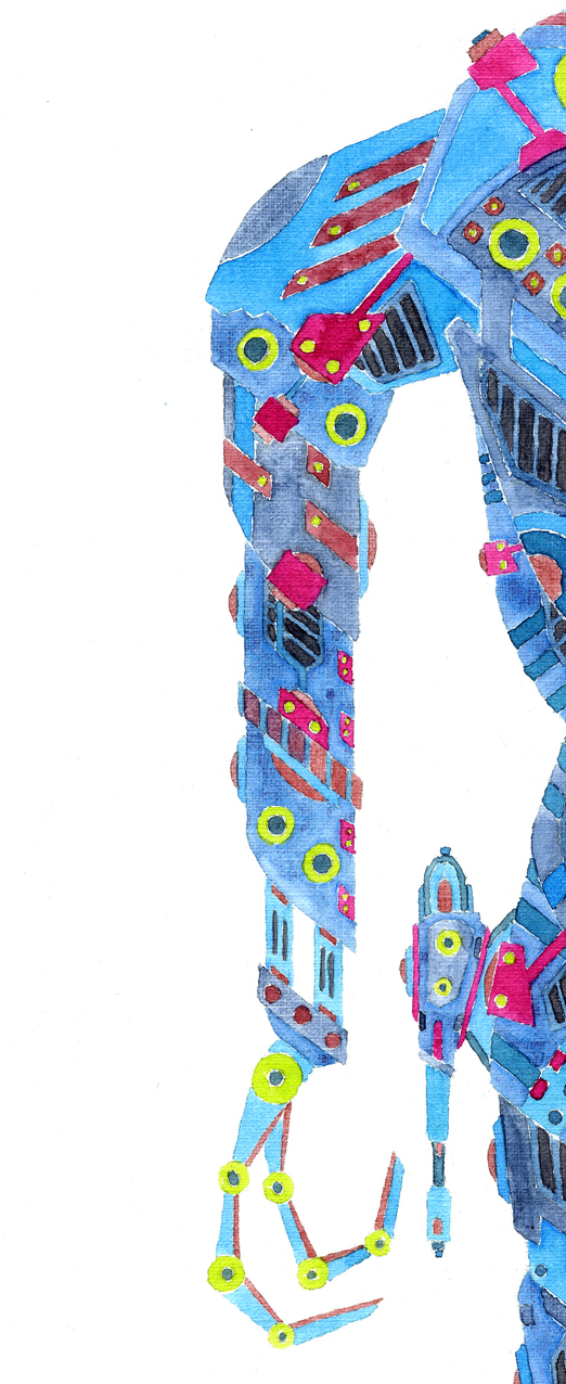
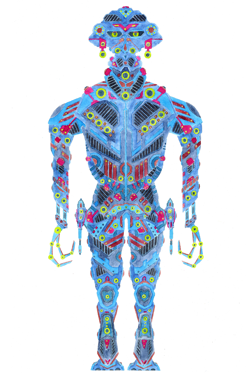
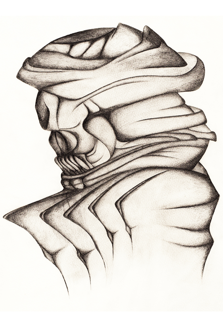
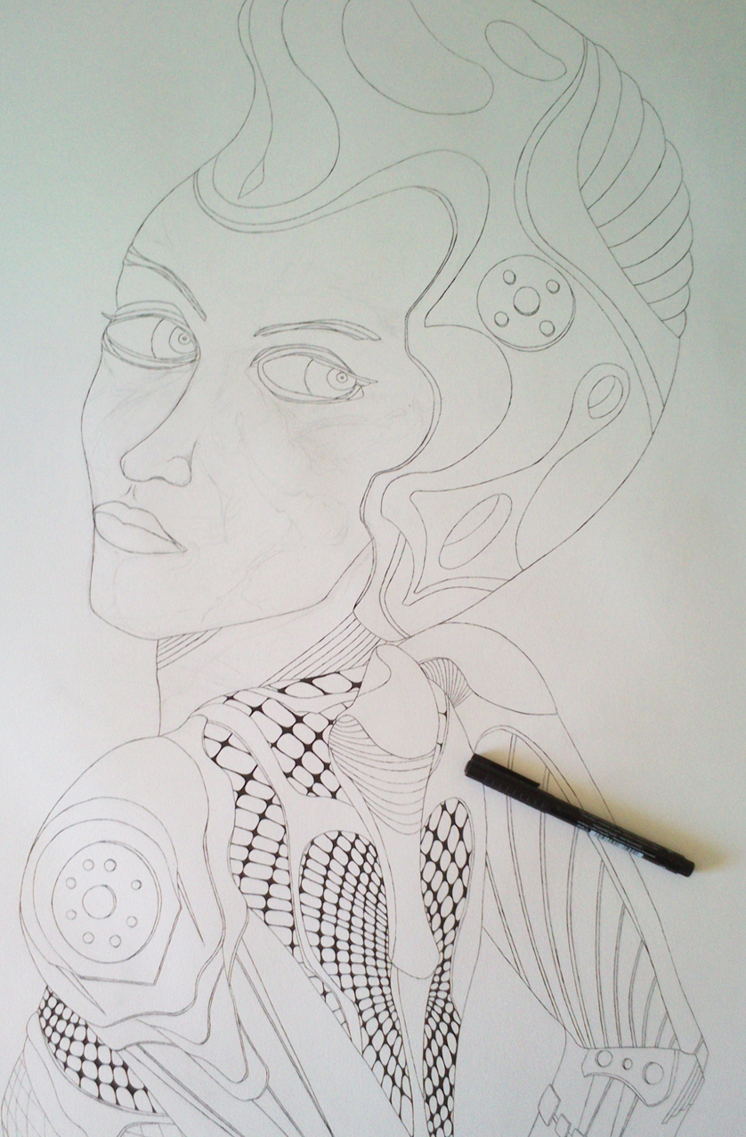
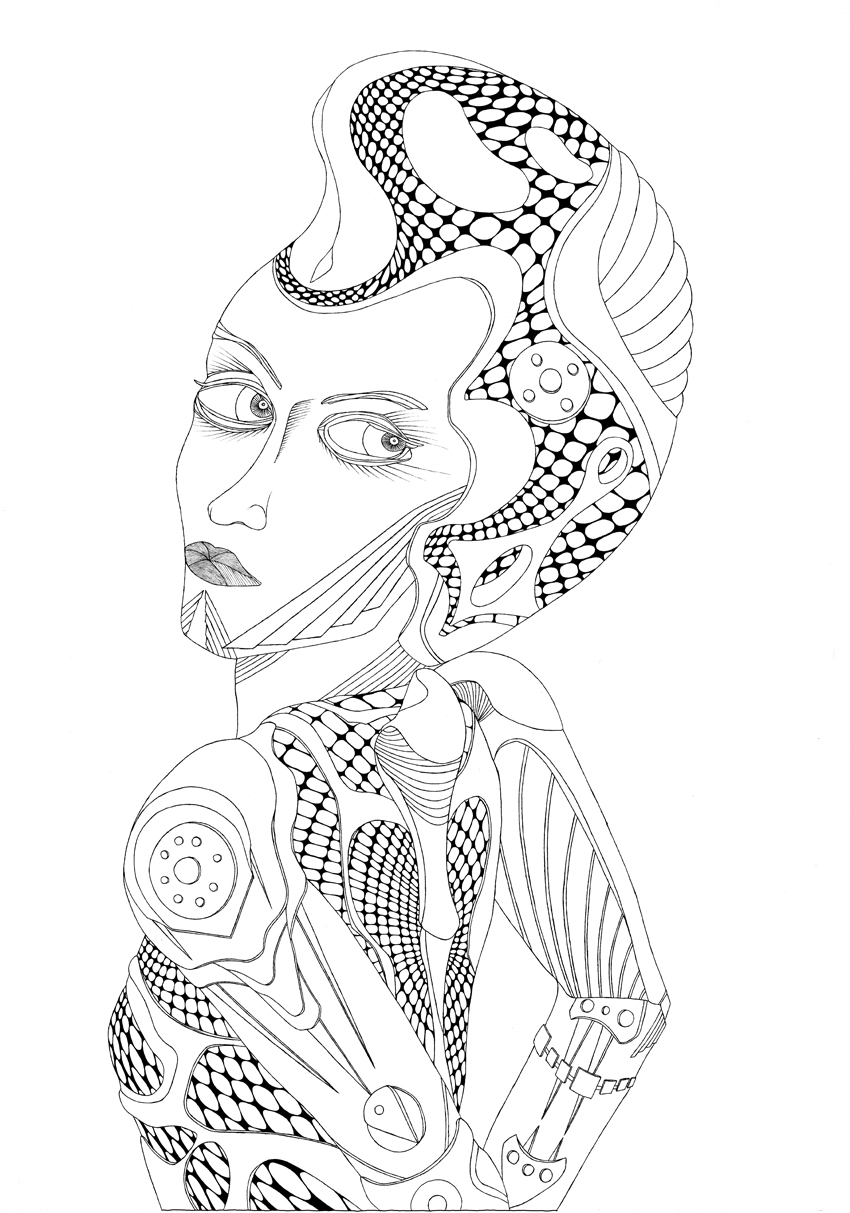
Robots is a series I started at the end of 2014 and I’m still working on it. Other characters and other technics are planned. I was thinking about our time now and the upcoming future. Robots or AI are already a part of our normal life as they do things in the industry but also in the military section. No human failure, no rest, nothing should go wrong. It’s been said that in the future intelligent robots and Artificial Intelligence will be able to make human planning and decisions. That’s the idea but think about military drowns or military robots. If something goes wrong and if responsible persons lose control. Then what?
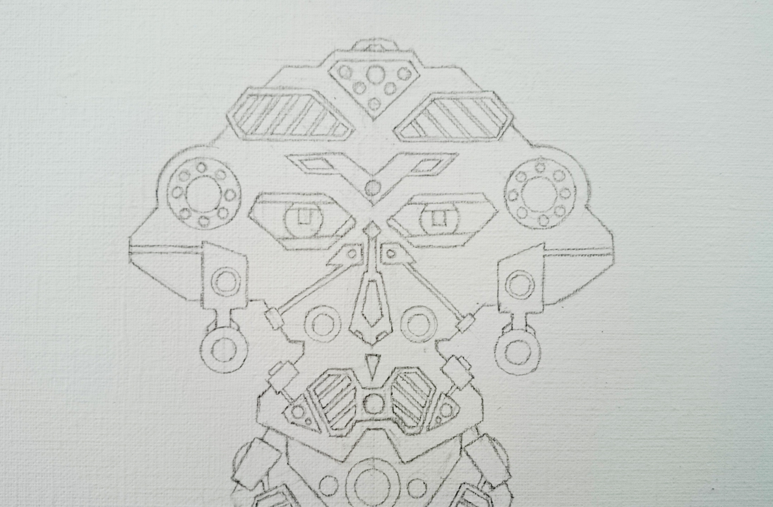
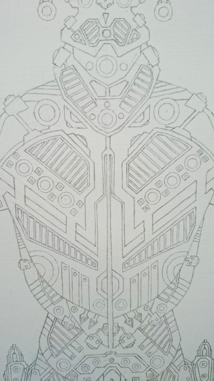
The way I started to work was a really easy step. Drawing a line from the top to the bottom of the paper. Then I began to draw the head and its parts by constructing geometric forms. The idea was to create the characters plane, abstract and surrealistic, without any shadows or plasticity. I had a kind of mural painting in my mind and wanted to keep it simple focusing on the coloured layers as a last step. I constructed first just one side and transferred later every point and every line or circle to the other side.
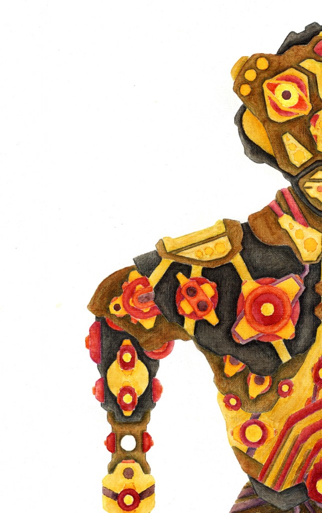
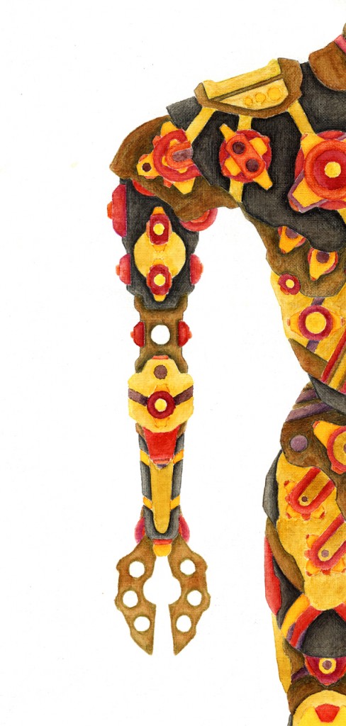
Robot painting „Robot 3“
Robot 3 – Illustration Vierneisel
Robot 3 – Illustration Vierneisel
Robot 3 – Illustration Vierneisel
Robot 3 – Aquarell Illustration
Robot 3 – Aquarell Illustration
Robot 3 – Aquarell Illustration
For the first one (see below) I used acrylic colour, later I changed to watercolour. The important fact is that I never made a sketch of the whole robot or the geometric parts like the head, the arms or the legs. I build it up completely from the top to the bottom.
Female body is a typical example of artwork I did a long time ago (August 2002) and I used it again during the time I learned how to use software such as Adobe Photoshop and especially Adobe Illustrator. Creating vector graphics was a new experience and I realised that I can use my drawings to generate versions of them. In this case just by adding layers of structures I also generated by using Adobe Illustrator. The drawing from 2002 was my own way to create surreal figures so that the following series was created in this period. Focussing on the human body and its shadows I used pictures of bodies and sculls to generate my own idea of them. Maybe they look dark but I think this depends on the personal definition of the viewer.
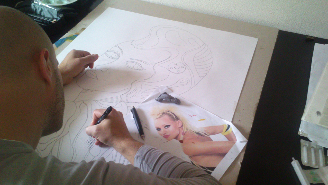
Space Girl is a large illustrative painting I did at the end of 2014. I collect pictures from newspapers, journals and other media to use them as drafts but I normaly only use the posture of a person as you can see here. The original picture is viewable on the photo above. I painted the picture in a large format (DIN A1) without any reason but as quite a lot of famous paintings show, the larger a painting is the more impressive it appears to the viewer. But maybe this only my personal sensation.
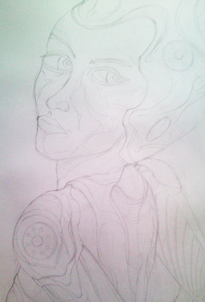
Illustration „Space Girl“
Space Girl Skizze
Space Girl Skizze 2
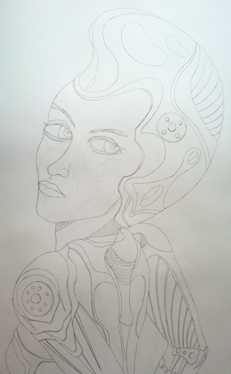
Space Girl Illustration
Space Girl Illustration final
Cookie-Zustimmung verwalten
Um dir ein optimales Erlebnis zu bieten, verwenden wir Technologien wie Cookies, um Geräteinformationen zu speichern und/oder darauf zuzugreifen. Wenn du diesen Technologien zustimmst, können wir Daten wie das Surfverhalten oder eindeutige IDs auf dieser Website verarbeiten. Wenn du deine Zustimmung nicht erteilst oder zurückziehst, können bestimmte Merkmale und Funktionen beeinträchtigt werden.
Funktional
Immer aktiv
Die technische Speicherung oder der Zugang ist unbedingt erforderlich für den rechtmäßigen Zweck, die Nutzung eines bestimmten Dienstes zu ermöglichen, der vom Teilnehmer oder Nutzer ausdrücklich gewünscht wird, oder für den alleinigen Zweck, die Übertragung einer Nachricht über ein elektronisches Kommunikationsnetz durchzuführen.
Vorlieben
Die technische Speicherung oder der Zugriff ist für den rechtmäßigen Zweck der Speicherung von Präferenzen erforderlich, die nicht vom Abonnenten oder Benutzer angefordert wurden.
Statistiken
Die technische Speicherung oder der Zugriff, der ausschließlich zu statistischen Zwecken erfolgt.Die technische Speicherung oder der Zugriff, der ausschließlich zu anonymen statistischen Zwecken verwendet wird. Ohne eine Vorladung, die freiwillige Zustimmung deines Internetdienstanbieters oder zusätzliche Aufzeichnungen von Dritten können die zu diesem Zweck gespeicherten oder abgerufenen Informationen allein in der Regel nicht dazu verwendet werden, dich zu identifizieren.
Marketing
Die technische Speicherung oder der Zugriff ist erforderlich, um Nutzerprofile zu erstellen, um Werbung zu versenden oder um den Nutzer auf einer Website oder über mehrere Websites hinweg zu ähnlichen Marketingzwecken zu verfolgen.